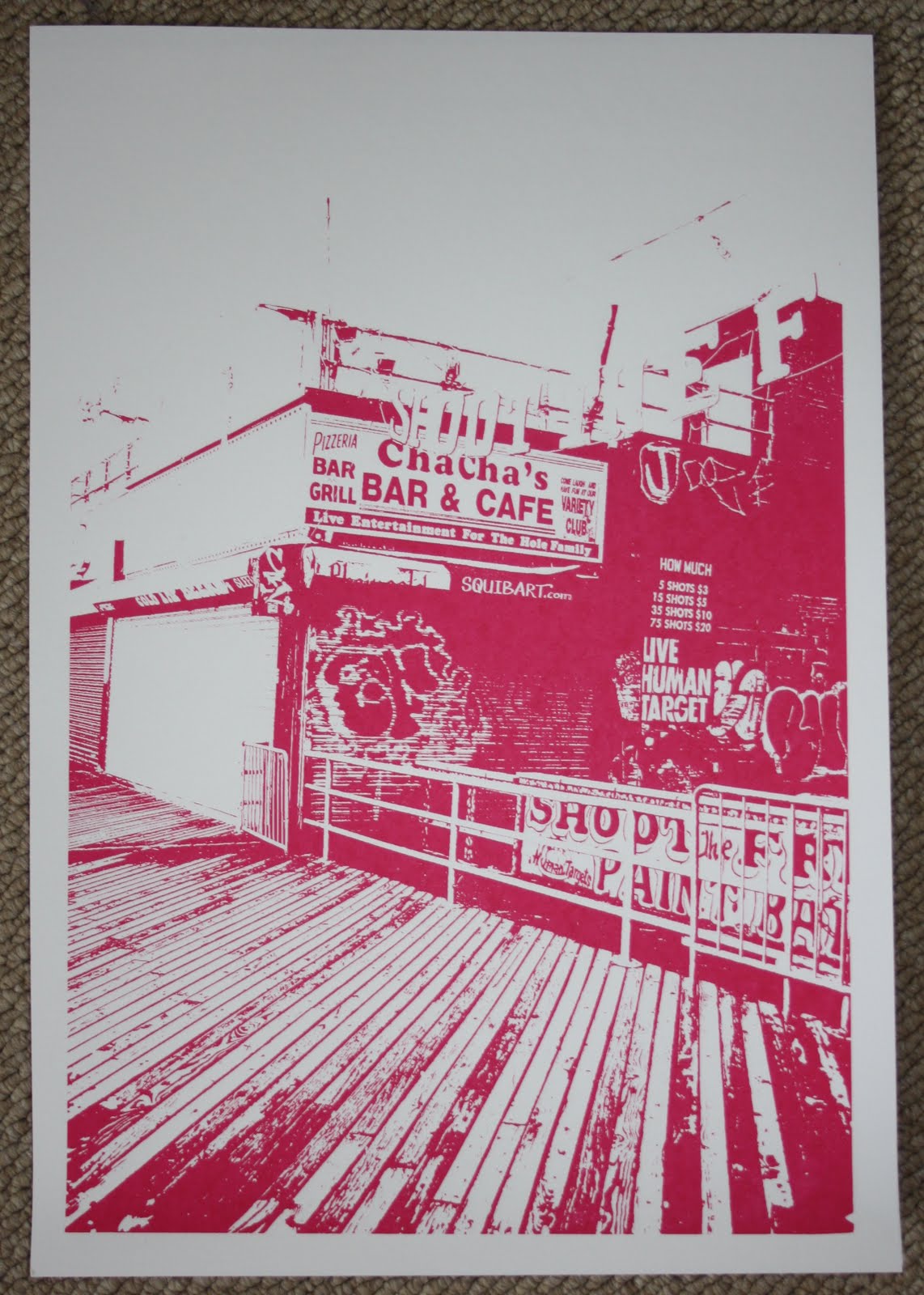
For one of my projects at the moment is from the ISTD live brief. It's called 'Fakery' and purely a typographic project. Im just having a play around with the different themes i could use, others have gone for political statements, or the commercial side for example make up etc... I'm having a look into the 'online presence' way and how people represent themselves, for example online dating. The above poster was experimenting with screen printing the typography and words.
I like the rough and ready feel from this 'experiment'!
I like the rough and ready feel from this 'experiment'!
Thanks!