
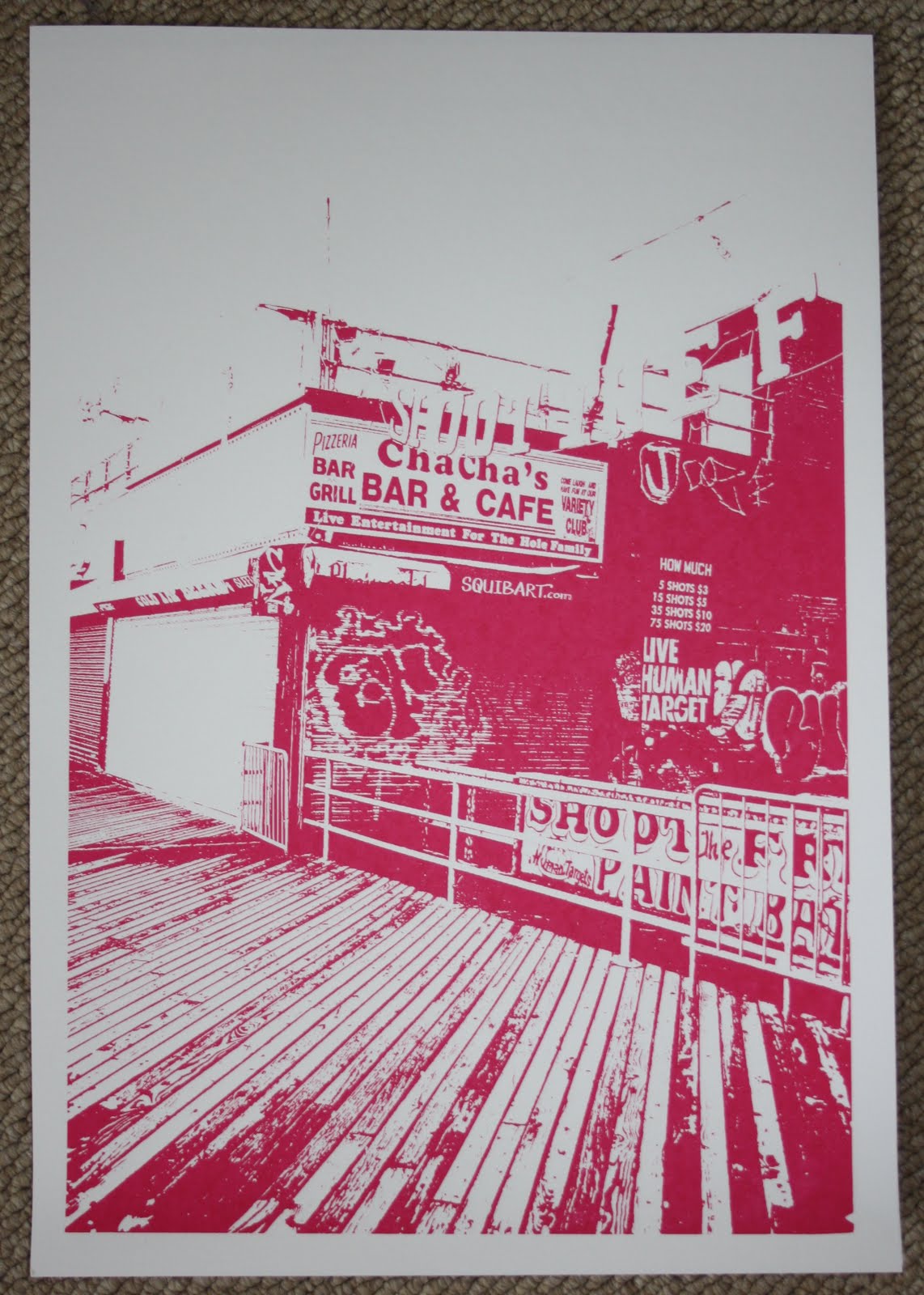


More from my NYC series of silk screened prints. Playing around with colours and different textures to get the right feel. My favourite is probably the orange and blue print, i think the colours work well together and reminds me of the grittiness of Coney Island itself. Another favourite is the blue yellow and pink, however only for the reasons it feels like its playing mind tricks when you actually look at the print closely which is crazy!
There are all A2 prints.
Thanks!
There are all A2 prints.
Thanks!
No comments:
Post a Comment